
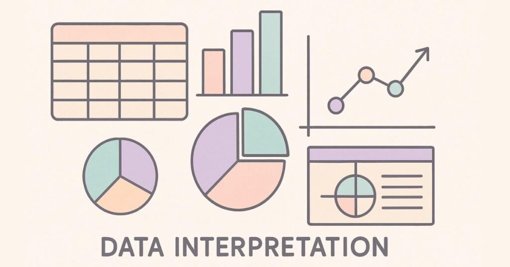
Data Interpretation Skills
Table of Contents
Blog Content:
Introduction: Why Data Interpretation Separates Average Scorers from Toppers
By now, you’ve mastered standalone quantitative concepts. But here’s what makes data interpretation different: it combines everything you’ve learned into realistic business scenarios. Companies don’t ask you to find the nth term of a series in isolation. They present business data—sales figures, market trends, customer demographics—and ask you to extract insights.
Data interpretation appears deceptively simple: read a table, answer questions. Yet it confuses even strong quantitative students because it requires conceptual clarity, calculation speed, AND critical thinking simultaneously.
Here’s the advantage: data interpretation problems are highly predictable. Once you master 5-6 chart types and understand calculation patterns, you’ll recognize most placement exam questions. This module teaches you systematic approaches that work across all data presentation formats.
Section 1: Understanding Data Interpretation Fundamentals
Why Companies Test Data Interpretation
Every business decision rests on data analysis. A marketing manager analyzes campaign performance through metrics. A supply chain manager tracks inventory through charts. A financial analyst interprets quarterly reports. Companies test data interpretation because they need employees who can extract actionable insights from raw numbers.
Unlike theoretical aptitude questions, data interpretation mimics real work. This is your chance to demonstrate not just mathematical ability, but business acumen.
The Three Layers of Data Interpretation
Layer 1: Reading and Comprehension
- Understand what the data represents
- Identify the units and scale
- Recognize what’s being compared
Layer 2: Calculation
- Perform accurate arithmetic under time pressure
- Apply percentages, ratios, and growth formulas
- Verify calculations quickly
Layer 3: Analysis and Inference
- Draw conclusions beyond direct numbers
- Identify trends and patterns
- Make predictions based on data
Most students focus only on Layer 2 (calculation) and fail because they miss Layer 1 (understanding) and Layer 3 (analysis).
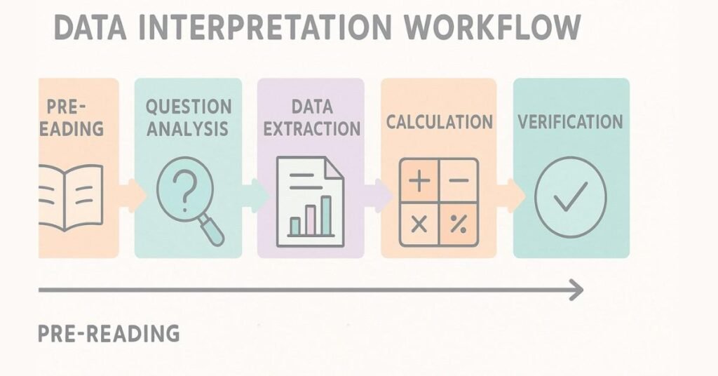
The Data Interpretation Workflow
Step 1: Pre-Reading (15 seconds)
Before calculating anything, scan the entire data set:
- What’s the title? (What’s being measured?)
- What’s the time period? (When is this data from?)
- What are the categories? (What’s being compared?)
- What are the units? (Rupees, percentages, thousands?)
Step 2: Question Analysis (10 seconds per question)
Before looking at the data, read the question carefully:
- What specifically is being asked?
- Do you need exact values or approximations?
- Is it asking for direct data or derived values?
Step 3: Data Extraction (20-30 seconds)
Locate relevant values in the data set:
- Highlight or mentally mark relevant numbers
- Identify all needed data points
- Note any missing or implied information
Step 4: Calculation (20-40 seconds)
Perform required calculations:
- Use estimation first (ballpark the answer)
- Calculate precisely if needed
- Round appropriately
Step 5: Verification (5-10 seconds)
Check your answer:
- Does it make logical sense?
- Is it within the data’s range?
- Did you answer what was asked?
Total time per question: 70-120 seconds (1.2-2 minutes)
Enhance Quant Skills → Explore Structured Learning
Section 2: Tables - The Most Direct Data Presentation
Understanding Table Structure
Tables present data in rows and columns—the most straightforward format. Yet students make errors because they misread which row/column contains relevant data.
Table Reading Strategy:
- Identify axes: What do rows represent? What do columns represent?
- Locate values: Find the intersection of the relevant row and column
- Note units: Is this in rupees, percentages, or raw count?
- Cross-check: Verify you’re reading the correct cell
Example Table: Company Sales Across Regions (in ₹ lakhs)

Question 1: What was the North region’s sales in Q3?
Direct answer: 60 lakhs (simple table lookup)
Question 2: Which region showed the highest growth from Q1 to Q4?
Calculation needed:
- North: 70 – 50 = 20 (growth of 20)
- South: 55 – 40 = 15 (growth of 15)
- East: 45 – 30 = 15 (growth of 15)
- West: 80 – 60 = 20 (growth of 20)
Answer: North and West both grew by 20 (tied)
Question 3: What’s the average Q2 sales across all regions?
Calculation:
(55 + 45 + 35 + 65) ÷ 4 = 200 ÷ 4 = 50 lakhs
Common Table Mistakes:
Mistake 1: Misreading Rows/Columns
Happens when table headers are confusing. Solution: Trace finger along row/column before reading value.
Mistake 2: Ignoring Units
Reading “70” without noting it’s “70 lakhs” instead of “70 units”. Solution: Circle or highlight units for every calculation.
Mistake 3: Calculating Wrong Comparison
Question asks “Which region improved the most from Q1 to Q2?” but you calculate “Q2 to Q4”. Solution: Circle relevant quarters before calculating.
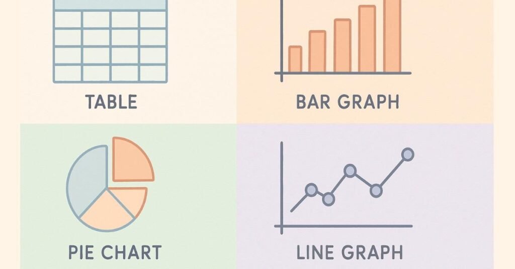
Section 3: Bar Graphs - Comparing Categories
Understanding Bar Graph Structure
Bar graphs compare values across categories. Length of bar = value of category. Longer bar = higher value.
Types of Bar Graphs:
Vertical Bar Graph (Column Chart)
- Categories on X-axis (horizontal)
- Values on Y-axis (vertical)
- Bar height represents value
Horizontal Bar Graph
- Categories on Y-axis (vertical)
- Values on X-axis (horizontal)
- Bar length represents value
Grouped Bar Graph
- Multiple bars per category
- Compares sub-categories simultaneously
Example: Company Revenue by Product (in ₹ crores)
text
60 |
50 | ████ (Product A)
40 | ████████ (Product B)
30 | ██████ (Product C)
20 | ████ (Product D)
10 |
0 |____________________
A B C D
Reading Bar Graphs:
Question 1: What’s the revenue for Product B?
Answer: Read the height of B’s bar = 40 crores
Question 2: Which product has half the revenue of Product B?
Calculation:
- Product B = 40
- Half of 40 = 20
- Looking at bars, Product D = 20
Answer: Product D
Question 3: What percentage of total revenue comes from Product C?
Calculation:
- Product C = 30
- Total = 50 + 40 + 30 + 20 = 140
- Percentage = (30/140) × 100 = 21.43%
Reading Grouped Bar Graphs:
When comparing multiple groups within categories, each category has multiple bars.
Example: Sales by Product for Q1 and Q2
text
50 | ██ ██ (Q1, Q2)
40 | ██ ██
30 | ██ ██
20 | ██ ██
10 |
0 |_____________
A B C D
Key reading rule: Each category (A, B, C, D) has two bars—one for Q1, one for Q2. Compare heights carefully.
Section 4: Pie Charts - Showing Proportions
Understanding Pie Chart Structure
Pie charts show how a total is divided among parts. Entire circle = 100% or total value. Each slice = proportion of that total.
Critical Insight: A pie chart’s usefulness depends on whether it shows percentages or absolute values.
Reading Pie Charts with Percentages:

Question 1: If total revenue is ₹100 crores, what’s revenue for Section B?
Calculation: 35% of 100 = 35 crores
Question 2: Ratio of A to C?
Calculation: 25:20 = 5:4
Reading Pie Charts with Absolute Values:

Question 1: What percentage does B represent?
Calculation: (35/100) × 100 = 35%
Common Pie Chart Mistakes:
Mistake 1: Assuming pie segments are equal
Visually, a 30% slice might look similar to a 25% slice. Always reference the legend.
Mistake 2: Missing the total value
If chart shows percentages but problem gives different total, recalculate. (If B is 35% and total is ₹200, not ₹100, then B = 70, not 35)
Mistake 3: Calculating ratios without converting
If chart shows “₹ in crores,” don’t directly compare with “₹ in lakhs.”
Section 5: Line Graphs - Showing Trends Over Time
Understanding Line Graph Structure
Line graphs track changes over time. X-axis = time periods. Y-axis = values. Line shows trend direction.
Critical Reading Elements:
- Slope: Steep up = rapid increase; flat = stable; down = decrease
- Peaks and valleys: Identify highest and lowest points
- Intersections: Where two lines cross = equal values at that time
Example: Stock Price Over 6 Months (in ₹)
text
100 | ╱╲
90 | ╱ ╲
80 | ╱ ╲
70 | ╱ ╲___
60 |_╱
|_______________
M1 M2 M3 M4 M5 M6
Question 1: What was the price in Month 3?
Answer: Read where Month 3 line is on Y-axis = 80
Question 2: In which month was the highest price?
Answer: Find peak of line = Month 2 at 100
Question 3: What’s the percentage change from M1 to M6?
Calculation:
- M1 = 60, M6 = 70
- Change = (70-60)/60 × 100 = 16.67% increase
Multiple Line Graphs (Comparing Trends):
When tracking multiple entities (e.g., Stock A vs Stock B), each has its own line. Different colors/styles differentiate them.
Key skill: Identify intersections (where trends cross) and comparative heights at each time point.
Section 6: Combination Charts - Multiple Data Types
Understanding Combination Charts
Some charts combine multiple visualization types: bars + lines, or multiple axes showing different scales.
Example: Revenue (Bars) and Profit Margin % (Line)
Left Y-axis: Revenue in ₹ crores (bars)
Right Y-axis: Profit margin in % (line)
Reading Strategy:
- Identify what each element represents
- Note which Y-axis each element uses
- Compare appropriately (don’t compare a ₹ value directly to a % value without context)
Common Combination Chart Mistakes:
Mistake 1: Confusing which axis goes with which element
Solution: Trace from element to its corresponding axis.
Mistake 2: Comparing values from different axes without converting
Solution: Mentally convert or note that comparison isn’t direct.

Section 7: Calculation Shortcuts for Data Interpretation
Approximation Technique: The 80-20 Rule
Many DI questions don’t require exact answers if options are far apart.
Example:
Data shows Sales of ₹47,832 and Cost of ₹18,956.
Question: “Approximate profit margin?”
Exact calculation:
(47,832 – 18,956) / 47,832 × 100 = 28,876 / 47,832 × 100 = 60.4%
Approximation:
- Sales ≈ 48,000
- Cost ≈ 19,000
- Profit ≈ 29,000
- Margin ≈ 29/48 ≈ 60%
If options are 40%, 55%, 60%, 70%, approximate answer is clearly 60%.
Percentage Shortcut: The 5-10-20-25 Rule
Memorize quick conversions:
- 5% = 1/20
- 10% = 1/10
- 20% = 1/5
- 25% = 1/4
- 50% = 1/2
Example: “What’s 20% of 350?”
Thinking: 20% = 1/5, so 350 ÷ 5 = 70
Much faster than: 0.20 × 350 = 70
Ratio Simplification Shortcut
Don’t simplify fully if you can eliminate options.
Example: Ratio of A to B = 47:63
Options: 3:4, 4:5, 5:6, 7:9
Instead of finding GCD and simplifying completely:
- Test 3:4 → 47:63 ≠ 75:100
- Test 7:9 → 47:63 ≈ matches pattern ✓
Answer: 7:9
Growth Rate Shortcut: The Compound Method
For year-on-year growth:
If growth is 10% annually for 2 years:
- Wrong: 10% + 10% = 20%
- Correct: Multiply by 1.1 twice = 1.21 = 21% total
But there’s a shortcut: Growth = base increase + (base increase × growth rate)
For 10% on 100: 100 → 110 → 121 = 21% total growth
Quick mental math: 10% + 10% + (1% interaction) ≈ 21%
Master Exam-Ready Aptitude Concepts → Browse Full Learning Paths
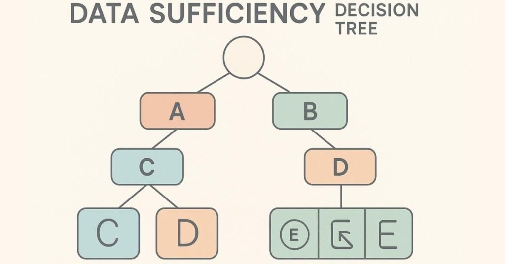
Section 8: Data Sufficiency - When You Don't Have All Information
Understanding Data Sufficiency Problems
Some placement exams include “data sufficiency” questions where you decide whether given information is enough to answer the question.
Answer Types:
- A) Statement 1 alone is sufficient
B) Statement 2 alone is sufficient
C) Both statements together are sufficient
D) Even both statements aren’t sufficient
E) Either statement alone is sufficient
Example Problem:
“What’s the percentage increase in sales from 2023 to 2024?”
Statement 1: 2023 sales were ₹100 crores
Statement 2: 2024 sales were ₹120 crores
To answer this question, you need both starting and ending values.
- Statement 1 alone: Insufficient (no ending value)
- Statement 2 alone: Insufficient (no starting value)
- Both together: Sufficient (can calculate 20% increase)
Answer: C
Another Example:
“How many employees in the East region?”
Statement 1: Total employees = 1000; East region has 30%
Statement 2: East region has 300 employees
- Statement 1: Sufficient (can calculate 30% of 1000 = 300)
- Statement 2: Sufficient (directly states 300)
Answer: E (Either alone is sufficient)
Stay Updated with Expert Aptitude Guides → Visit Learning Blog
Section 9: Strategic Approach to Data Interpretation Sets
Understanding Sets
Data Interpretation questions often come in sets—typically 4-6 questions based on one data visual.
Set Strategy:
Step 1: Pre-Read All Questions (1 minute)
Before looking at data, read all questions:
- Some might be easier than others
- You’ll know what to look for in the data
- Repeated themes appear
Step 2: Analyze the Data (1 minute)
- Understand structure
- Note scale and units
- Identify key relationships
Step 3: Attempt Easy Questions First (2-3 minutes)
- Direct lookup questions (not calculated)
- These build confidence
- Ensure you understand the data
Step 4: Tackle Medium Questions (4-5 minutes)
- Single calculation required
- Build on data understanding
Step 5: Leave Difficult Questions for Last
- Multiple steps required
- Only if time permits
Set Time Allocation:
For a 5-question set:
- Easy questions: 1.5 minutes total
- Medium questions: 3-4 minutes total
- Difficult questions: 1-2 minutes (attempt if time)
- Review: 1 minute
Total: 7-8 minutes for entire set (well within the 10-15 minutes typically allocated)
Section 10: Common Data Interpretation Pitfalls
Pitfall 1: Unit Mismatch
Data shows “Sales in ₹ lakhs” but you calculate as if it’s ₹ crores.
Solution: Highlight units for every data point before calculation.
Pitfall 2: Misreading Scales
Y-axis goes from 0 to 100, but jump is by 20s (0, 20, 40, 60, 80, 100). You read a bar at the 3rd mark as 30 when it’s actually 60.
Solution: Trace bar to axis carefully; don’t assume even distribution.
Pitfall 3: Confusing “Total” vs “Per Unit”
Chart shows total profit but question asks “profit per product.” You forget to divide by number of products.
Solution: Re-read question twice before calculating. Identify what’s being asked.
Pitfall 4: Rounding Errors
You round 47.8 to 48, then to 50, then calculate. Errors compound.
Solution: Round only in final step. Keep intermediate calculations precise.
Pitfall 5: Comparing Incomparable Data
You compare revenue in 2020 with revenue in 2024 without adjusting for inflation or growth factors mentioned in the data.
Solution: Note all given assumptions and apply them to all calculations.